Complex uses of css3 box-shadow
Sort of as a follow-up to the previous post on html5 and css3, I've been applying css3 to various situations to see how it does. I've run across a couple examples where box-shadow in particular doesn't quite manage what I need it to do, this post will present the workarounds I found.
I'll be referring to the use of varied shadow size and intensity to create a consistent sense of depth. I highly recommend this summary of the subject, which is actually what got me thinking about the second case here.
Fixed menus and tabs
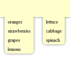
What happens when you have a header (or other element) with a box shadow and tabs or a drop-down menu suspended from it? Ideally, those items would have matching shadows to maintain the illusion of depth. You may want something like the following image:
Unfortunately, if you just have a shadow on each of the menus and the header you're more likely to end up with something like one of these:
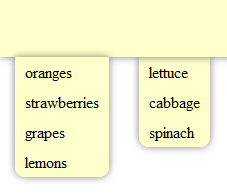
The menu on the left is inside the header element and positioned so the top of the menu is at the bottom of the header. The menu's shadow is cast on top of the header, which is probably not what anyone wants.
The problem with the one on the right is a little more subtle, and a lot of web designs do it all the time. But it may not feel quite right, because shadow is an indication of depth. The shadow cast on the menu is the same as that cast on the page, indicating that they are at the same depth, but the menu casts a shadow too, indicating that it is not at the same level as the page below the header. It would actually be more consistent not to include a shadow from the right menu at all.
The left menu also has that problem: the header and menu cast the same shadow, indicating that they are at the same depth, but the shadow from the menu onto the header says that they are not.
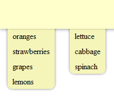
One solution to this is to use something like the first menu but to cut off the shadow at the top that it casts onto the header to put the menu and the header at the same depth. Overflow:hidden will do nicely for that. (You might want to have your menu looking like it's layered between the header and the body, I'll get to that later.)
We'll have the following html:
<header>
    <nav>
        <ul>
            <li>oranges</li>
            <li>strawberries</li>
            <li>grapes</li>
            <li>lemons</li>
        </ul>
        <ul>
            <li>lettuce</li>
            <li>cabbage</li>
            <li>spinach</li>
        </ul>
    </nav>
</header>
There are two unordered lists nested inside a nav element. (This example is html5, but of course you can use divs with classes too.) The nav element is what we'll use to trim off the tops of the menus. The key css is here:
header { display: block; width: 100%; height: 100px; background-color: #FFC; box-shadow: 0 0 10px rgba(0,0,0,.5); }
nav { display: block; position: absolute; top: 100px; left: 0; width: 100%; overflow: hidden; padding-bottom: 10px; }
nav ul { margin: -10px 15px 0 15px; padding: 10px 0 0 0; float: left; background-color: #FFC; border-radius: 10px; box-shadow: 0 0 10px rgba(0,0,0,.5); }
nav ul li { margin: 0; padding: 5px 10px; list-style: none; }
The nav is absolutely positioned to the bottom of the header with overflow:hidden. The boxes for the unordered lists will start at the top of the nav, but the shadow will extend above the top edge of the nav and be cut off. Here the lists also have a negative margin to cut off the top rounded corners instead of using extra "border-top-radius" etc. styles, but that isn't really necessary.
Drop-down menus
That all works great if you just want a static tab extending from your header, but if you want real interactive drop-down menus it gets a little more complicated. Say we have the following:
<header>
    <nav>
        <ul>
            <li>fruit
                <ul>
                    <li>oranges</li>
                    <li>strawberries</li>
                    <li>grapes</li>
                    <li>lemons</li>
                </ul>
            </li>
            <li>leafy greens
                <ul>
                    <li>lettuce</li>
                    <li>cabbage</li>
                    <li>spinach</li>
                </ul>
            </li>
        </ul>
    </nav>
</header>
Each of the drop-down menus is now inside another list element that contains the header for that menu. The menu headers should appear inside the header, and hovering or clicking should cause the menu to appear.
We can't just use the nav element to cut off the top anymore because that will clip the header too. I keep saying how awesome css is in letting us take out extra elements we've been using for rounded corners and shadows, but we're going to have to put one back in for this (d'oh). Lets wrap each of the drop-down menus in another nav (or div, or whatever you like--semantics people can argue about that one, nav seemed appropriate to me):
<header>
    <nav>
        <ul>
            <li>fruit
                <nav>
                    <ul>
                        <li>oranges</li>
                        <li>strawberries</li>
                        <li>grapes</li>
                        <li>lemons</li>
                    </ul>
                </nav>
            </li>
            <li>leafy greens
                <nav>
                    <ul>
                        <li>lettuce</li>
                        <li>cabbage</li>
                        <li>spinach</li>
                    </ul>
                </nav>
            </li>
        </ul>
    </nav>
</header>
Now it will be the inner nav only that gets positioned at the bottom of the header with overflow:hidden:
nav nav { position: absolute; top: 30px; left: 0; padding: 0 20px 10px 20px; overflow: hidden; }
nav ul ul { display: none; background-color: #FFC; border-radius: 10px; box-shadow: 0 0 10px rgba(0,0,0,.5); border: 1px solid #979700; margin: -10px -10px 0 -10px; padding-top: 10px; }
nav ul li:hover ul { display: block; }
nav ul ul li { float: none; padding: 5px 10px; }
Notice the extra margins and paddings in there to make sure the list is lined up correctly and the nav element isn't cutting off any other sides of the shadow.
Multiple shadow depths
What if you want to have two elements overlapping at different distances from the background (i.e., something with a longer, lighter shadow on top of something with a shorter, darker one). The shadow of the upper element will need to be shorter where it overlaps the second element than where it is over the background.
You can use this technique on the drop-down menus mentioned above tomake them look like they're lower than the header they're dropping from, but lets start with something simpler first. Let's say you have a header with a shadow and a sidebar that should look like it's half way between the header and the background page. You may want to end up with something like this:
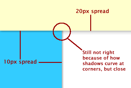
I've made the header shadow spread 20px and the shadows on top of and cast from the sidebar 10px each to add up to 20. You could also make it 5 and 15, or some other ratio you like. I've also made them slightly darker, but I can't think of a formula to use for that.
If you just have the header cast the shadow and the sidebar cast a separate shadow it will be a uniform 20px all the way across. What we want is two separate shadows under the header in addition to the one cast by the sidebar. Unfortunately, we're going to have to add extra elements to get that.
What we need is one shadow to go all the way across at the bottom of the header underneath the sidebar and another above the sidebar but below the real header so it's possible to click through to the logo or whatever else is in there. That means something like this:
<div class="fakeshadow"></div>
<header></header>
<nav>
    <div class="fakeshadow"></div>
</nav>
There are two extra elements there, one just in the body and one inside the nav element that's going to be the sidebar.
The nav and the "fakeshadow" element inside it will have the 10px shadow. The "fakeshadow" div above the header will go under everything and have the 20px shadow, which the nav will cover. Here's the css:
header { display: block; position: relative; z-index: 2; width: 100%; height: 100px; background-color: #FFC; }
.fakeshadow { position: absolute; top: 0; left: 0; z-index: 0; width: 100%; height: 100px; box-shadow: 0 0 20px rgba(0,0,0,.5); }
nav { position: absolute; top: 0; left: 0; z-index: 1; width: 200px; height: 100%; background-color: #3CF; box-shadow: 0 0 10px rgba(0,0,0,.7); }
nav .fakeshadow { box-shadow: 0 0 10px rgba(0,0,0,.7); }Combining everything: drop-down menus with multiple shadow depths
If we add some of those "fakeshadow" elements to the drop down menus and adjust the menu shadow, we can get something like this:
The fakeshadow element is added to the drop-down list, so the html looks like this:
<header>
    <nav>
        <ul>
            <li>fruit
                <nav>
                    <ul>
                        <li class="fakeshadow"></li>
                        <li>oranges</li>
                        <li>strawberries</li>
                        <li>grapes</li>
                        <li>lemons</li>
                    </ul>
                </nav>
            </li>
            <li>leafy greens
                <nav>
                    <ul>
                        <li class="fakeshadow"></li>
                        <li>lettuce</li>
                        <li>cabbage</li>
                        <li>spinach</li>
                    </ul>
                </nav>
            </li>
        </ul>
    </nav>
</header>
The fake shadow has a box shadow of 4px and the lists now have a shadow of only 6, so the modified css looks like this:
header { display: block; position: relative; width: 100%; height: 100px; background-color: #FFC; box-shadow: 0 0 10px rgba(0,0,0,.5); }

nav { position: absolute; top: 70px; left: 0; }
nav ul, nav li { margin: 0; padding: 0; }
nav ul li { list-style: none; float: left; padding: 5px 20px; position: relative; }

nav nav { position: absolute; top: 30px; left: 0; padding: 0 20px 10px 20px; overflow: hidden; }
nav ul ul { display: none; background-color: #F5F5BA; border-radius: 10px; box-shadow: 0 0 6px rgba(0,0,0,.5); margin: -10px -10px 0 -10px; padding-top: 10px; }
nav ul li:hover ul { display: block; }
nav ul ul li { float: none; padding: 5px 10px; }
nav ul ul li.fakeshadow { padding:0; height:1px; left:0; margin-top:-2px; box-shadow:0 0 4px rgba(0, 0, 0, 1); }
The background color was also adjusted a little bit to bring out the effect.
Bonus: Animated tabs
Added 3/15/10 because I can't seem to get the idea out of my head
In this example, the tabs move when you hover over them but the shadow remains stationary. It also demonstrates the use of :before (or :after) instead of using a completely separate element in the html.
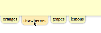
The tabs are each li elements with a style similar to that applied to the menu ul above:
<header>
    <nav>
        <ul>
            <li>oranges</li>
            <li>strawberries</li>
            <li>grapes</li>
            <li>lemons</li>
        </ul>
    </nav>
</header>
There are no fake elements this time--we can also add those fake shadows with :before or :after pseudo-elements. Here's the css:
nav ul { margin: 0; padding: 0; list-style: none; }
nav ul li { margin: -10px 5px 0 5px; padding: 10px 5px 5px; float: left; background-color: #F5F5BA; border-radius: 10px; box-shadow: 0 0 6px rgba(0,0,0,.5); position: relative; cursor: pointer; }
nav ul li:before { content: ' '; height:1px; width: 100%; position: absolute; left: 0; top: 9px; box-shadow:0 0 4px rgba(0, 0, 0, 1); }
nav ul li:hover { padding-top: 15px; background-color: #FDEBB3; }