How do we design for learned helplessness?
Over thanksgiving weekend I had the experience of helping my mother reset her Facebook password. Now, she doesn't really know anything about computers, but she's an intelligent woman and perfectly capable of learning if she only believed she could. The whole conversation between us was littered with her saying she couldn't possibly do it herself, she'd never remember what I was telling her, etc. Let's take this bit about copy-paste:
Mom: "There were all these numbers and letters I had to type in the email, and I wrote them down but it didn't work."
Me: "You know, you can get the computer to copy that for you and tell it to stick it into the other window."
Mom: "You can? I didn't know that."
Me: "Yeah, it's really handy, I'll show you."
Mom: "Oh, but I'll never remember how to do that."
Copying and pasting isn't hard, and it's definitely not beyond her ability to learn or remember. She knows all sorts of stuff that's a lot more technical than that, but she decided before I even told her how to do it that it was too hard for her. I think the problem is akin to learned helplessness--it's not that she can't learn to do it herself or that she can't remember, but that she believes that any effort on her part is useless, she'll never be smart enough to learn to use this computer thing.
The interesting thing is that she knows more than she thinks she does, she can figure some things out on her own. She had already managed to send herself a password reset email, but was helpless to find the link or even navigate her mail client (which was one I'd never used before) without my help the moment I was looking over her shoulder. In retrospect, it seems sort of defensive--getting my help on things she could probably do to prevent real criticism when she makes a real mistake, or in other words, pretending to be stupid so I don't think her actual ability is stupid. The upshot is that even if you could get someone like her into a usability study (protesting all the while that you couldn't possibly want her, she doesn't know anything about computers!) you probably wouldn't ever get real behavior.
So how do you design for someone who doesn't believe they're smart enough to use your system? The trick is adding a sense of empowerment and taking out the disempowering elements (without disempowering more skilled users), but what does that mean? I don't really know the answer to that, but it's an interesting lens through which to try to view a design. Let's take a look at the Facebook password reset process. I'm not picking on Facebook, here, it's just what Mom happened to need help with but it could be any website.
Step 1: Sending the password reset email
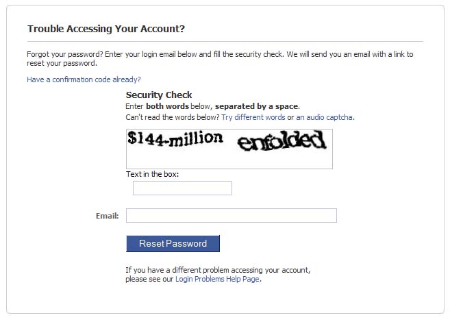
The page you get to when you click on the "forgot your password" link is pretty cluttered. What do you look at first here? As someone experienced with the web, I know a captcha when I see one and I know what it's used for, but it's the biggest, boldest thing on the page and it doesn't make any sense. It looks techy, as my mom would put it. Sure, it prevents robots from resetting people's passwords for them, but there are other ways to do that.
If you must use a captcha, there are better ways to present them, ways that don't detract from the two things that actually matter on this page--the description that says enter your email address to get a reset link and the field where you enter your email address, now currently separated by the big block of nonsense. Hiding the captcha until after the critical text is entered and then displaying it with an animated transition and friendly explanatory text that this is here to stop the naughty robots would be a good move, too.
Most users will figure out what to do here from having seen this sort of process elsewhere before, but for someone who doesn't know the pattern you should emphasize the one simple thing they need to do here. All we need is your email address and maybe a few nonsense words. There, wasn't that easy? Let's move on to the next step.
Steps 2 & 3: The password reset confirmation page and the email
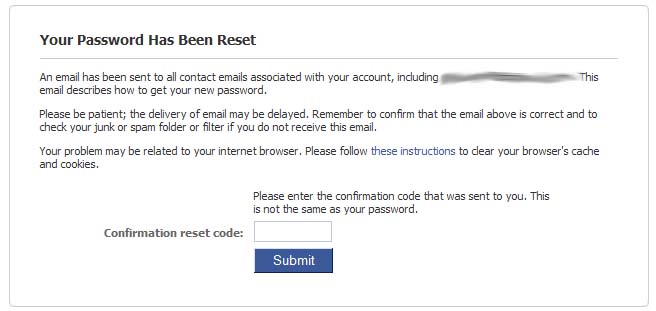
After you submit the password reset page, you get a confirmation page telling you that an email has been sent and asking you to enter a code from the email into the box. Honestly, I think you could remove almost all the text from this page without losing anything--the wall of text is intimidating and unnecessary. The thing that matters is that you should go check your email. Users who are still having trouble can click to open up suggestions.
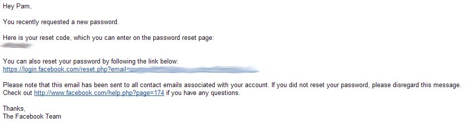
Mom was confused by the confirmation code thing, and really I can't see why it exists. It's completely redundant with the link that is also sent in the email. It's easier for anyone to click on the link (how many email clients don't support them these days?), and just as easy to copy and paste for those users who now how. Mom doesn't know how to copy and paste text, and she was confused about what to use as the code, anyway, and whether she still needed it when she clicked the link, but she knows exactly what to do with a link if you just tell her to click it and nothing else. The link is simple enough to understand. The code adds "techy" stuff that has to be written down and remembered, and I really don't see the benefit of providing multiple redundant methods of setting a password.
Step 4: Changing the password
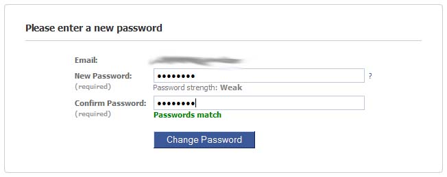
Mom liked this page. She approved of the "Passwords match" checker telling her that she got it right before she submitted the form. She didn't understand the password strength thing, and I don't think she even noticed the question mark next to the field, which just looks like a question mark, not a link or other item that could be acted on. I told her to ignore the strength meter, no one is going to try to steal her facebook account and remembering a harder password for someone who is already concerned about remembering technical things is not worth the effort. (I also told her it's ok to write it down and stick it on the monitor.) I have no idea how to incorporate that into a design heuristic--explaining the password strength would incorporate dire warnings about stolen accounts, but how do you know when it's better to ignore the advice?
Conclusions, such as they are
I don't really have any ground-breaking conclusions to draw from this, mostly it's an interesting thought experiment. Anything I can say is just good design advice:
- remove all unnecessary content (this includes alternative methods of doing something, except perhaps on pages meant for experts)
- emphasize the important things (happens naturally if you remove unnecessary things)
- don't separate items that need acting on from their explanations
- remove jargon and other techy sounding things when they aren't necessary
- when techy things like captchas are necessary, make them friendly and non-threatening, and hide them until necessary
- "?" doesn't make a good help icon unless you make it look like a button
- feedback as you progress is a good thing
- advice you give to some users will be bad for others