Reminders, part 3: registration and login flow

One of the goals of the reminders project is to simplify everything as much as possible.  That includes the login and registration processes and the auxiliary features that go with them like forgotten password resets, other password changes, and email changes as well as the actual reminder creation and completion.  Sometimes it seems like the simplest things are the most complex; I've built login and registration forms before, but when you really get into it there are enough corner cases that it seemed prudent to diagram it all out and make sure I've got everything streamlined in all possible circumstances.

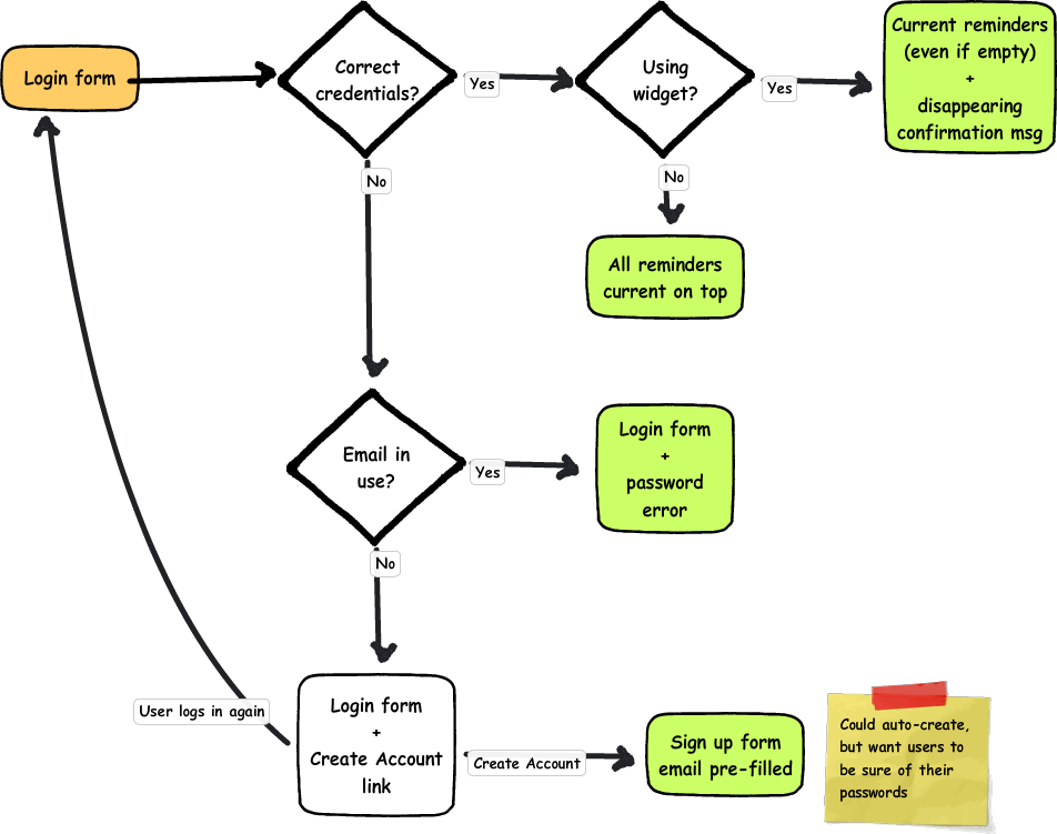
I originally thought of having a single form for either login or registration--if the user existed, they would be logged in, otherwise a new account could be created.  Of course, it's not really a good idea to create a new account if the user just got their username wrong, those people need a message saying that the username they gave doesn't exist.  I've seen applications of this that have a "I'm creating a new account/I'm logging in" toggle, but that seems inelegant and potentially confusing.

An alternative is to use the error message to say "that account doesn't exist, would you like to create it?" and then automatically create it using the entered username and password.  This would still require a separate registration form, or at least the appearance of being a separate form, and this form should likewise redirect the user to log in where appropriate, or perhaps even just log them in without redirecting.  Separating the forms matches the mental model and the convention of there being two separate activities, but the processes need to remain interconnected so it they are still streamlined for those users who have forgotten they have an account or don't pay very much attention to which form they're typing into.

Registration

Flow chart of the registration process (content described in detail below)

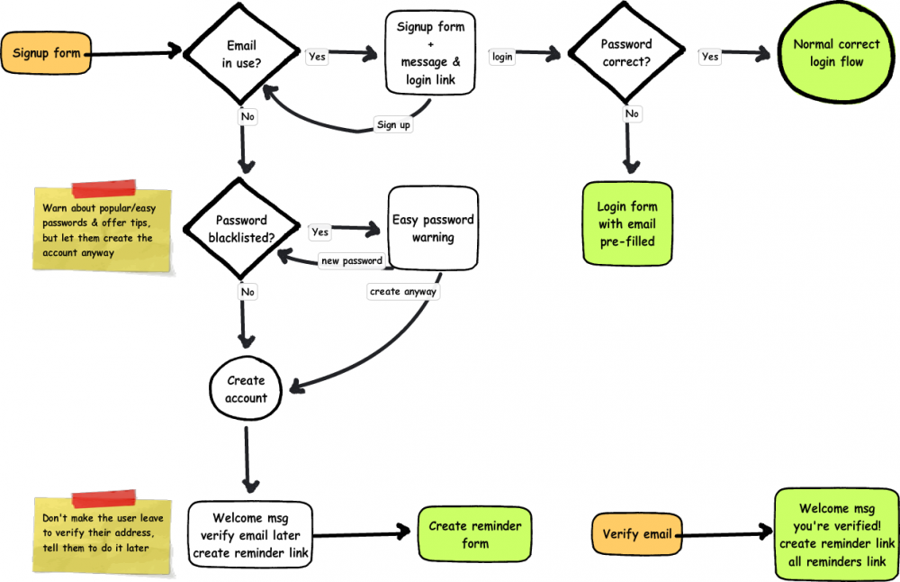
The registration form is going to be as simple as possible--an email address which will be used as a username, a password, and perhaps an "I'm over 13" checkbox as legally required.  The email address should be unique per user, so if it's in use that user probably already has an account.  Email verification is already necessary since the system may send out emails, so it should not be possible to use someone else's email address.

The simplest case is that the user comes to the registration form, enters an email that has never been used before and a good password, their account is created and a "verify your email" message is sent to that email address, and they are taken straight into creating reminders and asked to verify their email address later.  Creating a reminder should also give them a warning about unverified email addresses.

The next use case is basically the same, but the user has entered a very common password like "1234".  I believe that web developers have the responsibility to educate (but unobtrusively!) when users do something that may harm themselves, but also to allow them to do it if they really want to.  To that end, I'm adding an additional registration step that warns the user that their password is one of the N most common, and could be guessed by a hacker in <10 seconds, for example.  At that point the user can choose to use it anyway or pick a new one, at which point registration continues as before.  This step would also be part of any process that involves changing a password.

It is also possible that the email address the user gives is already in use.  Probably this is because they already have an account; if so, the user may also have given the password that belongs to that account, and can just be logged in according to the normal login process below.  Otherwise, they will receive an error message that the email address given is in use and a link to log in, which will pre-fill the email address.

It is also possible that someone else registered the account, but in that case they would not have been able to verify the email address.  Users can still log into an un-verified account, and they can have the password reset (described further below), so the legitimate owner of an email address should be able to gain control of an account registered to it.  The simplest flow I have for that case is 1. try to create an account; 2. try to log in; 3. reset password.  It's a little awkward to go through step 2 for an account the user never registered themselves, but for the most part step 2 is appropriate and it won't be appropriate to include a password reset link directly on the failed registration form.  It may also be awkward to take over an account that someone else registered and added their own reminders to, but I'm not sure how to do that aside from requiring verification first, which is awkward for new users and affects a lot more people.

Being able to take over an account that is associated with your own email address is a good thing in the case mentioned above, but it could also be a bad thing if someone puts in an email address they do not use, it expires, and someone else takes it.  Like anything else that uses email password resets, it will have to be the responsibility of the user to maintain a current email address on their account.  If they really do use the account, logging in with an old email may serve as a reminder to update it, otherwise they may have to have a human verify that they own the account and change the email, and enough information needs to be logged that someone could do that.

Logging in

Flow chart of the login process (described in detail in text)

What happens when a user logs in depends on where they are logging in from.  I'm still planning on having a desktop widget to show current tasks, so logging in on the widget will take take the user to the current tasks--even if it's empty--with a welcome back message that disappears after a moment on top.  On the web, successfully logging in will take the user to a list of all their reminders with the tasks that come up soonest on top.

Many login forms make no distinction between username and password errors, they merely tell you that the combination of them is wrong.  I've heard security cited as the reason for this--if it tells you that a username doesn't exist, then an automatic script can move onto the next username and try to crack that one's password.  Personally, I think there are better methods of protecting users' accounts, and it's a better experience for the user if they know which field is wrong, so this login form will distinguish the two types of error.

If the email address the user provides does not exist, they will be told that the email does not exist and asked if they want to make a new account.  If the user decides not to create a new account, they can enter a different email address and try logging in again.

Clicking a create account link could automatically generate an account with the password already provided, but I want to be sure that those users know they're creating an account and to be sure what their passwords are before continuing.  Submitting the registration form takes the user into the registration process described in the previous section.

If the email address is in the system but the password is not correct, the user will be told that the entered password is incorrect and asked if they would like to have their password reset.

Forgotten passwords

Flow chart for resetting passwords (described in detail in text)

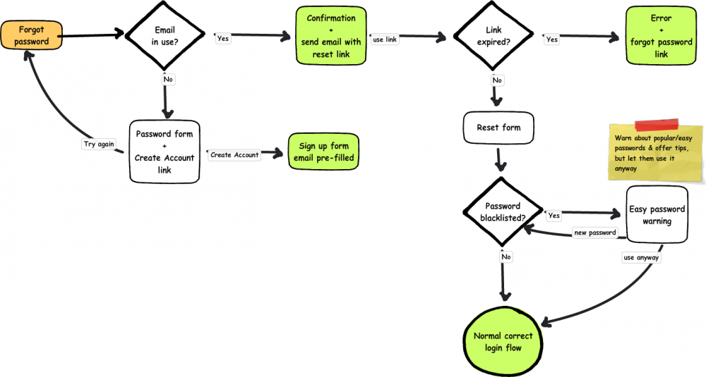
Resetting a user's password involves first sending a password reset link to a user's email, which they then must click on in a certain period of time to get the form to change their password.  In the simplest scenario, the user finds the page from the login form, enters the email of an existing account, goes straight to their email and clicks the reset link, enters a good password, and is logged in.

Hopefully users won't click through to this page if they don't have an account, but they might still not know what email they used.  If the email address is wrong, users are given an error and asked if they want to create an account just like the login, but I anticipate that fewer users will use it from this page.

Password reset links will have an expiration period for greater account security.  If a user uses the link after that period of time they will be given a message telling them that it has expired and a new link has been emailed to them.  Otherwise, the user will get a form with a password field, which will have the same password quality check as the signup form.

As mentioned before, it is possible to get into a state where you cannot reset your own password because you no longer have the email address associated with it.  Those users will probably need to talk to someone to get their account back, but I have not yet decided where that fits into this flow.  Perhaps it will just be in some informational text on the password reset page and on a separate support page.

Password changes

Flow chart of changing a password (described in detail in text)

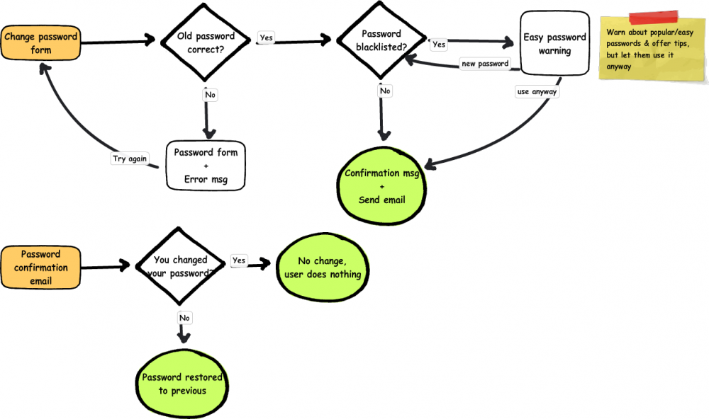
The normal password change process will be accessed by logged-in users, and requires the previous password instead of the user's email address.  Like other methods of setting passwords, it will tell ask the user if they want to change a weak password but will not require them to.

Changing a password this way will also send the user an email, but if they actually did change their password they will not need to do anything with it.  The email merely serves to warn users that their password is changed in case it was updated by someone else, and will allow them to set it back to what it was without having to know the new password.

Email changes

Flow chart of changing an email address (described in detail in text)

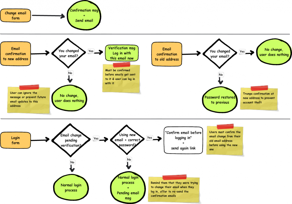
Changing email addresses is a little more complicated because it must be confirmed at both email addresses to prevent spam and account theft and because email is used to log in.

The basic email change form is simple, it just takes a new email address and responds with a confirmation message and sends two emails.  The email to the old address is merely an alert like the password change message, it just gives the user a chance to set it back to what it was in the event that someone tried to set it for them.  For the most part it can be ignored.

The email to the new address does require the user to confirm that this is their new address, both to prevent email to someone who doesn't want it and to make sure the email is correct so the user actually gets their reminders.  If the new email is never confirmed, the system continues to use the old email.

I'm not quite sure how to handle unconfirmed email addresses when logging in.  I think that maybe the login form should not accept the new email address until it is confirmed in case it belongs to someone else, but on the other hand unconfirmed email addresses are accepted for new accounts.

Regardless of whether or not the form allows the user to log in with the new email address, if the user has the password correct it should tell the user that they must confirm their new email address, and that the official address associated with the account will continue to be the old one until they confirm the new one.  There should also be a link to re-send the confirmation email in case the old one has gotten lost or deleted.

It also ought to be possible to continue logging in with the old address until the new one is confirmed, since the new one really isn't official yet.  Once the email is confirmed it's probably ok for it to be impossible to log in with the old one.

What's next?

The next step is probably to make a site map with all of these auxiliary pages to make sure I don't miss any, and wireframe or diagram any that I haven't done yet like account deletion.  After that I can start on higher fidelity and full-page wireframes for the website and widget versions, and then maybe I can start on building things.

How (not to) write an alert message

If your alert message needs instructions, you're doing something wrong.

Confusing dialog message headed by "Don't click "OK" if your system is running fine"

This is what you get when you ignore the poor usability warning signs.

Reminders, part 2: wireframes

The heart and soul of the reminder application is going to be creating reminders and viewing a list of current reminders. There will also have to be some auxiliary features like viewing all (not just current) reminders, editing reminders, and deleting reminders. This will all also be hosted on a server, and that means accounts--signing up, logging in, forgotten passwords, and deleting accounts.

So far I've put together some wireframes for reminder lists and creating a new reminder, and some task flows for logging in, signing up, and resetting a password.  I'll save the login and registration flowcharts for the next post and just talk about the reminder lists and creating a new reminder here.

Reminder lists

Task list.  Basically the same for current and all tasks.  Tasks with the earliest "due date" appear at the top, color (& text) indicates age.

The current reminders list and the all reminders list should be about the same, with the exception, of course, that all reminders shows things you'll have to do some time in the future and things you've already done or recently deleted, and current reminders should be only things you currently have to do.

Current reminders may be completely empty most of the time--that's totally fine, especially with the desktop widgets, where it shouldn't take up any more space than absolutely necessary.  To that end, I've also made the longer description collapsible--it may not even be necessary to have the longer description, just a name, which would simplify this and the creation form nicely.  Most of the time there should just be unobtrusive buttons to create a new reminder or view all of them, making it much more obvious when one does actually appear.

When a task is visible, it should be possible to mark it as done, edit it, and delete it.  It should also show how urgent it is--for many of these sorts of tasks it doesn't matter if they don't get done right away, but bad things may happen if one waits too long to do them.  The time window probably depends on the task, and I've made it possible to set it in the "new reminder" form as you'll see below, but it might be better to simplify the form and just assume some standard period of time that people think works for most things.  It'll take a bit of research to see which is better, and if there is a standard timeframe what it should be.

One of the things I like to keep in mind when designing things is that everything should be reversible.  There are all sorts of studies that show that people just click through confirmation dialogs without thinking about them, which means stopping a user before they do something irreversible just doesn't work.  I've tried to set up this interface so that there are no irreversible tasks, anything that can be done can be undone.  Editing of course just takes another edit.  Marking things as finished and deleting them should make them disappear from the current tasks list, but they should stick around for a few moments and slowly fade out of sight so the user has time to undo the action if it was an accident.  They'll also appear in the All Reminders view, though deleted reminders should probably disappear from there too after a few days to get out of the way.

Creating and editing reminders

The form for creating a reminder.  Users can say what it is, when they need to do it relative to now, how long they should take to do it, whether/how often it repeats, and if they want email alerts.

The reminder creation form is a little longer than I originally intended; as mentioned above, it's possible that I can just get rid of the long description and the "When do you want to have it done by?" questions, reducing it down to just 4 questions.  One of my goals here is to make this as quick and painless as possible.  Having sensible defaults can help with this too, but that'll take some time seeing what people tend to actually put in the form.  And there may not be a sensible default for everyone, so there might have to be something in the backend that senses how people are actually using it and adapts.

All in all I think the form is pretty straight-forward.  The questions are pretty much how I intend to phrase them; I was going for a direct, conversational style and trying to avoid the short, jargony, disconected phrases that event schedulers often use.

I've made all of the dates relative, and I hope having the number selector followed by a drop-down of days/weeks/months/years embedded in a sentence will make sense.

One thing in particular to point out is the email section.  I mentioned in the previous post that emails are not ideal for task reminders, and I'd prefer to make something ambient; however, it's possible that something ambient isn't sufficiently noticeable, and anyway I'm not going to be able to support every platform that way.  I'm one lone developer, and I may be able to get something functional on Windows and Mac but I don't really intend to support each of the multiple desktop widget packages available on Linux, each with it's own custom python api.  So I've tried to address the previous concern with emails--that they get deleted or disappear under other things before I've done the task--by adding repeated emails.  Users will be able to click a link from the email to mark the task as completed.

The other thing to mention is that it should be easy for users to turn off all of those emails all at once without going through all of their tasks.  But if they do that and forget, they may be confused or angry when they don't receive an email from a new task added afterwards.  I've added a warning message there, and perhaps there should also be one on the task lists if there are tasks that send emails and emails are turned off.

After a task is created, the user should probably be taken back to the current tasks list.  But the task almost certainly won't be visible there yet, so it may be a little disconcerting to the user that they don't see it.  There will probably need to be a confirmation message of some sort displayed at the top of the form that gets out of the way after a few moments, probably with the name of the task and "in 6 months" or whenever it needs to be done.

What needs to be done

I've already diagrammed the login process that I want, and I'll talk about that a bit in the next post.  I'd like to wireframe that process, and also document the process for marking tasks finished via email, unsubscribing from all emails via the emails and via account preferences pages, and deleting accounts.

After that I'd like to build something interactive incorporating the feedback I'll hopefully have gotten from what I've posted so far, solicit more feedback on the whole process from that, and then maybe start building the real thing.

Reminders for infrequent tasks

I've had this idea floating around for a while that it would be nice to have something to remind me to do things that I do infrequently--things like change the oil in my car, change the air filters, go to the doctor for check-ups, etc.

These are the sorts of tasks that need to be done every few months or yearly, but the exact date on which I do them doesn't matter, there's just sort of an open time window.  I've been using Google calendar to send me an email about these things, but since the date doesn't really matter I don't do them right away and then the notification is gone and I forget.

So I've been thinking a lot about reminders, and what people need in a reminder system like this, and I decided maybe I should design and build something.  Designing is fun, and building would give me an opportunity to learn something new, like maybe Ruby on Rails or Django.

I'm sort of designing for myself, but one of the goals here is to make it general enough that a lot of people might find it useful.

Requirements

The big problem with the email reminders from google calendar is the email comes once (or however many times you set it up for), is tied to a particular day, and then it's gone whether you've done it or not.  But unlike events, tasks usually don't just go away at a particular date, they remain until you do them.

To some extent, physical calendars have this property--you can see all of the tasks for the month every time you look at it until you turn to the next month.  A string around your finger will stick around until you take it off, as will a note stuck to something you see every day.

So that gives us the first requirement:

  1. Persistent.  Reminders should stick around until the task is done.

Another quality possessed by calendars, strings, and notes but not necessarily emails is that they are available even when you aren't specifically looking for them.  When a reminder is on a calendar, you may be looking up something else, but it's there at the periphery reminding you.  You may never have to explicitly look for it, it's just there already.  That quality is called ambient awareness.

Of course, something to keep in mind about ambient reminders is that after a while they become like the furniture in your house, you just walk around it without thinking about it anymore.  If a reminder sticks around too long, a user may cease noticing it and forget about it.

So our second requirement:

  1. Ambient, with optional occasional foregrounding.  Reminders should be available without specifically looking for them, but occasionally bringing them to the users explicit attention may be ok.

The third requirement perhaps should go without saying, because it's about general usability and overhead.  Setting up these reminders should be no more difficult than writing them on a calendar or it's not going to happen.  Everything that isn't necessary should be out of the way or rephrased to fit the task at hand.

For instance, don't ask the user to translate "I need to do this in 6 months" into a specific date; a calendar does, of course, but that can be done relatively quickly visually.  A text box requires extra mental calculation, and it's not even necessary since the date isn't already important to the user.

So the third requirement is just basic ease of use:

  1. Quick and easy.  Don't ask unnecessary questions.

A lot of things don't make it into calendars because the calendar isn't there right when someone is thinking about something they need reminding about.  It's also not reasonable to ask users to check something every day to see if they created a reminder 6 months ago.  So that's our final requirement, and it's sort of related to making things quick and easy:

  1. Always available.  Users shouldn't have to remember to create or check their reminders.

Some brainstorming

There are a number of things that many people see and check everyday on their computers, like their desktop, their email, their web browsers, social network sites, etc.  It seems like the most natural and universal place to put something like this is probably the desktop, and newer operating systems already have desktop widgets that open when the computer starts.

I've never made one before, but it sounds like both windows and mac widgets are based to some extent on html, css, and javascript, which may mean I can make something at least somewhat cross-platform.  I'm not sure about the widgets that come with some flavors of Linux.  There may also be some facility for local storage, but if I want to make it available anywhere--any computer, phone, etc.--storing data "in the cloud" may be a better idea.  That means looking directly at a website or using apis, and it also means account creation and all that that entails.

I also wanted to consider "foregrounding" the ambient reminders, which means some sort of notification.  I'm not sure how desktop widgets hook up to the various platform notification systems, but email might do also.

I'm not really sure how important the "available anywhere" component is.  Certainly many people have multiple computers, but I'm not sure about mobile.  I suspect that creating reminders will be more important than checking them there.  Either way, I think I would prefer to create a mobile site than a dozen mobile apps tailored to different devices, especially if Apple is outlawing anything not originally written in Objective C.

What to call it?

I'm terrible at naming things, so suggestions would be appreciated.

You can find further notes in the portfolio section.

Complex uses of css3 box-shadow

Sort of as a follow-up to the previous post on html5 and css3, I've been applying css3 to various situations to see how it does.  I've run across a couple examples where box-shadow in particular doesn't quite manage what I need it to do, this post will present the workarounds I found.

I'll be referring to the use of varied shadow size and intensity to create a consistent sense of depth.  I highly recommend this summary of the subject, which is actually what got me thinking about the second case here.

Fixed menus and tabs

What happens when you have a header (or other element) with a box shadow and tabs or a drop-down menu suspended from it?  Ideally, those items would have matching shadows to maintain the illusion of depth.  You may want something like the following image:

A drop-down menu below a header with a continuous shadow around the outside

Unfortunately, if you just have a shadow on each of the menus and the header you're more likely to end up with something like one of these:

Two menus with inconsistent shadows

The menu on the left is inside the header element and positioned so the top of the menu is at the bottom of the header.  The menu's shadow is cast on top of the header, which is probably not what anyone wants.

The problem with the one on the right is a little more subtle, and a lot of web designs do it all the time.  But it may not feel quite right, because shadow is an indication of depth.  The shadow cast on the menu is the same as that cast on the page, indicating that they are at the same depth, but the menu casts a shadow too, indicating that it is not at the same level as the page below the header.  It would actually be more consistent not to include a shadow from the right menu at all.

The left menu also has that problem: the header and menu cast the same shadow, indicating that they are at the same depth, but the shadow from the menu onto the header says that they are not.

One solution to this is to use something like the first menu but to cut off the shadow at the top that it casts onto the header to put the menu and the header at the same depth.  Overflow:hidden will do nicely for that.  (You might want to have your menu looking like it's layered between the header and the body, I'll get to that later.)

We'll have the following html:

<header>
    <nav>
        <ul>
            <li>oranges</li>
            <li>strawberries</li>
            <li>grapes</li>
            <li>lemons</li>
        </ul>
        <ul>
            <li>lettuce</li>
            <li>cabbage</li>
            <li>spinach</li>
        </ul>
    </nav>
</header>

There are two unordered lists nested inside a nav element. (This example is html5, but of course you can use divs with classes too.) The nav element is what we'll use to trim off the tops of the menus. The key css is here:

header { display: block; width: 100%; height: 100px; background-color: #FFC; box-shadow: 0 0 10px rgba(0,0,0,.5); }
nav { display: block; position: absolute; top: 100px; left: 0; width: 100%; overflow: hidden; padding-bottom: 10px; }
nav ul { margin: -10px 15px 0 15px; padding: 10px 0 0 0; float: left; background-color: #FFC; border-radius: 10px; box-shadow: 0 0 10px rgba(0,0,0,.5); }
nav ul li { margin: 0; padding: 5px 10px; list-style: none; }

The nav is absolutely positioned to the bottom of the header with overflow:hidden.  The boxes for the unordered lists will start at the top of the nav, but the shadow will extend above the top edge of the nav and be cut off.  Here the lists also have a negative margin to cut off the top rounded corners instead of  using extra "border-top-radius" etc. styles, but that isn't really necessary.

demo page

Drop-down menus

That all works great if you just want a static tab extending from your header, but if you want real interactive drop-down menus it gets a little more complicated.  Say we have the following:

<header>
    <nav>
        <ul>
            <li>fruit
                <ul>
                    <li>oranges</li>
                    <li>strawberries</li>
                    <li>grapes</li>
                    <li>lemons</li>
                </ul>
            </li>
            <li>leafy greens
                <ul>
                    <li>lettuce</li>
                    <li>cabbage</li>
                    <li>spinach</li>
                </ul>
            </li>
        </ul>
    </nav>
</header>

Each of the drop-down menus is now inside another list element that contains the header for that menu. The menu headers should appear inside the header, and hovering or clicking should cause the menu to appear.

We can't just use the nav element to cut off the top anymore because that will clip the header too.  I keep saying how awesome css is in letting us take out extra elements we've been using for rounded corners and shadows, but we're going to have to put one back in for this (d'oh).  Lets wrap each of the drop-down menus in another nav (or div, or whatever you like--semantics people can argue about that one, nav seemed appropriate to me):

<header>
    <nav>
        <ul>
            <li>fruit
                <nav>
                    <ul>
                        <li>oranges</li>
                        <li>strawberries</li>
                        <li>grapes</li>
                        <li>lemons</li>
                    </ul>
                </nav>
            </li>
            <li>leafy greens
                <nav>
                    <ul>
                        <li>lettuce</li>
                        <li>cabbage</li>
                        <li>spinach</li>
                    </ul>
                </nav>
            </li>
        </ul>
    </nav>
</header>

Now it will be the inner nav only that gets positioned at the bottom of the header with overflow:hidden:

nav nav { position: absolute; top: 30px; left: 0; padding: 0 20px 10px 20px; overflow: hidden; }
nav ul ul { display: none; background-color: #FFC; border-radius: 10px; box-shadow: 0 0 10px rgba(0,0,0,.5); border: 1px solid #979700; margin: -10px -10px 0 -10px; padding-top: 10px; }
nav ul li:hover ul { display: block; }
nav ul ul li { float: none; padding: 5px 10px; }

Notice the extra margins and paddings in there to make sure the list is lined up correctly and the nav element isn't cutting off any other sides of the shadow.

demo page

Multiple shadow depths

What if you want to have two elements overlapping at different distances from the background (i.e., something with a longer, lighter shadow on top of something with a shorter, darker one).  The shadow of the upper element will need to be shorter where it overlaps the second element than where it is over the background.

You can use this technique on the drop-down menus mentioned above tomake them look like they're lower than the header they're dropping from, but lets start with something simpler first.  Let's say you have a header with a shadow and a sidebar that should look like it's half way between the header and the background page.  You may want to end up with something like this:

Shadows of varying perceived depths

I've made the header shadow spread 20px and the shadows on top of and cast from the sidebar 10px each to add up to 20.  You could also make it 5 and 15, or some other ratio you like.  I've also made them slightly darker, but I can't think of a formula to use for that.

If you just have the header cast the shadow and the sidebar cast a separate shadow it will be a uniform 20px all the way across.  What we want is two separate shadows under the header in addition to the one cast by the sidebar.  Unfortunately, we're going to have to add extra elements to get that.

What we need is one shadow to go all the way across at the bottom of the header underneath the sidebar and another above the sidebar but below the real header so it's possible to click through to the logo or whatever else is in there.  That means something like this:

<div class="fakeshadow"></div>
<header></header>
<nav>
    <div class="fakeshadow"></div>
</nav>

There are two extra elements there, one just in the body and one inside the nav element that's going to be the sidebar.

The nav and the "fakeshadow" element inside it will have the 10px shadow.  The "fakeshadow" div above the header will go under everything and have the 20px shadow, which the nav will cover.  Here's the css:

header { display: block; position: relative; z-index: 2; width: 100%; height: 100px; background-color: #FFC; }
.fakeshadow { position: absolute; top: 0; left: 0; z-index: 0; width: 100%; height: 100px; box-shadow: 0 0 20px rgba(0,0,0,.5); }
nav { position: absolute; top: 0; left: 0; z-index: 1; width: 200px; height: 100%; background-color: #3CF; box-shadow: 0 0 10px rgba(0,0,0,.7); }
nav .fakeshadow { box-shadow: 0 0 10px rgba(0,0,0,.7); }

demo page

Combining everything: drop-down menus with multiple shadow depths

If we add some of those "fakeshadow" elements to the drop down menus and adjust the menu shadow, we can get something like this:

Drop-down menus with multiple shadow levels so menus look like they're closer to the background

The fakeshadow element is added to the drop-down list, so the html looks like this:

<header>
    <nav>
        <ul>
            <li>fruit
                <nav>
                    <ul>
                        <li class="fakeshadow"></li>
                        <li>oranges</li>
                        <li>strawberries</li>
                        <li>grapes</li>
                        <li>lemons</li>
                    </ul>
                </nav>
            </li>
            <li>leafy greens
                <nav>
                    <ul>
                        <li class="fakeshadow"></li>
                        <li>lettuce</li>
                        <li>cabbage</li>
                        <li>spinach</li>
                    </ul>
                </nav>
            </li>
        </ul>
    </nav>
</header>

The fake shadow has a box shadow of 4px and the lists now have a shadow of only 6, so the modified css looks like this:

header { display: block; position: relative; width: 100%; height: 100px; background-color: #FFC; box-shadow: 0 0 10px rgba(0,0,0,.5); }

nav { position: absolute; top: 70px; left: 0; }
nav ul, nav li { margin: 0; padding: 0; }
nav ul li { list-style: none; float: left; padding: 5px 20px; position: relative; }

nav nav { position: absolute; top: 30px; left: 0; padding: 0 20px 10px 20px; overflow: hidden; }
nav ul ul { display: none; background-color: #F5F5BA; border-radius: 10px; box-shadow: 0 0 6px rgba(0,0,0,.5); margin: -10px -10px 0 -10px; padding-top: 10px; }
nav ul li:hover ul { display: block; }
nav ul ul li { float: none; padding: 5px 10px; }
nav ul ul li.fakeshadow { padding:0; height:1px; left:0; margin-top:-2px; box-shadow:0 0 4px rgba(0, 0, 0, 1); }

The background color was also adjusted a little bit to bring out the effect.

demo page

Bonus: Animated tabs

Added 3/15/10 because I can't seem to get the idea out of my head

In this example, the tabs move when you hover over them but the shadow remains stationary.  It also demonstrates the use of :before (or :after) instead of using a completely separate element in the html.

Tabs with shadows and hover states

The tabs are each li elements with a style similar to that applied to the menu ul above:

<header>
    <nav>
        <ul>
            <li>oranges</li>
            <li>strawberries</li>
            <li>grapes</li>
            <li>lemons</li>
        </ul>
    </nav>
</header>

There are no fake elements this time--we can also add those fake shadows with :before or :after pseudo-elements. Here's the css:

nav ul { margin: 0; padding: 0; list-style: none; }
nav ul li { margin: -10px 5px 0 5px; padding: 10px 5px 5px; float: left; background-color: #F5F5BA; border-radius: 10px; box-shadow: 0 0 6px rgba(0,0,0,.5); position: relative; cursor: pointer; }
nav ul li:before { content: ' '; height:1px; width: 100%; position: absolute; left: 0; top: 9px; box-shadow:0 0 4px rgba(0, 0, 0, 1); }
nav ul li:hover { padding-top: 15px; background-color: #FDEBB3; }

demo page

HTML5, CSS3, and the Great CSS-Off

A while back I entered the Great CSS-Off over at CSS-Tricks.  You can find my file here.  I used the contest as an excuse to play with html5, css3, and using only semantically meaningful markup.  It was an interesting experience, and I'd like to share some of the things I discovered.

HTML5

I found myself wanting a <content> element to match <header> and <footer>.  I've found this on several other projects I've messed about with html5 on, too.  I've since been told that "everything that isn't in <header> or <footer> tags is content, so you don't need it," but

  • It's a useful styling wrapper to prevent a lot of redundant css (and ok, maybe css isn't a very good reason to include markup if you're going semantic)
  • It feels really semantically inappropriate to put all my <p>, <img>, etc. tags at the same tree-level as <header> and <footer>.  They are not the same level of content.  I guess I could use <section>, but it still feels like section should be something that goes inside <header>, <footer>, and <content>.

I also discovered that I don't really understand <hgroup>.  Can/should I put it around my headers if there's only one?  What if there's a possibility that I might add/remove headers later?  What's up with this "document outline" thing, how do I preview it to see if it's doing what I meant?  Can I use it for markup?

It also seems like html5 and microformats don't naturally coexist very nicely, but I guess they're working on that.

CSS(3)

There are a lot of cool new things in css3, and it really can be used to substantially reduce markup (no more decorative rounded corner caps, woo!), especially when combined with things like :before and :after. Border images are awesome, and I really love the button styles I was able to get with a combination of border-radius, background gradients, and box-shadow:

"Keep reading" button with base style (top), hover style (middle) and active style (bottom) using CSS3

/* css to create the above buttons; text styles and -moz and -webkit prefix versions removed for space */
.more, .more:visited {
    line-height: 25px;
    color: #e97e7e;
    border: 1px solid #88706c;
    padding: 0 13px;
    border-radius: 13px;
    box-shadow: 0 0 3px rgba(0, 0, 0, .5);
    background-color: rgb(110, 38, 38);
    background-image: -moz-linear-gradient(#934d4d, #6f2828);
    background-image: -webkit-gradient(linear, 0% 0%, 0% 90%, from(#934d4d), to(#6f2828));
}
.more:hover, .more:focus { /* increase brightness by 10% */
    color: #ffa1a1;
    background-color: rgb(135, 47, 47);
    background-image: -moz-linear-gradient(#ad5c5c, #8a3232);
    background-image: -webkit-gradient(linear, 0% 0%, 0% 90%, from(#ad5c5c), to(#8a3232));
}
.more:active { /* increase saturation by 10% and add an inner shadow */
    color: #e87b7b;
    background-color: rgb(135, 34, 34);
    background-image: -moz-linear-gradient(#944040, #701d1d);
    background-image: -webkit-gradient(linear, 0% 0%, 0% 90%, from(#944040), to(#701d1d));
    box-shadow: 0 0 3px rgba(0, 0, 0, .7), inset 0 3px 3px rgba(0, 0, 0, .5);
}

However, despite all the new developments I still ran into a lot of limitations that it really seems like css should have overcome by now.

Text pseudoclasses: first n words, nth line, etc.

The mockup for the contest had the first three words of each paragraph bolded.  This seemed like a purely stylistic, not semantic, boldening, but all css gives you is first-line and what I needed was first-n-words.  Similarly, there were quotations at the bottom that had 3 lines each, each with a different color.  Again, purely stylistic, not semantic, so I didn't want to add markup, but how do you get 3 different colors when all you have is first-line?  I ended up using javascript for both of those, and the second one ended up being a pretty seriously ugly hack.

It's been pointed out to me that these are pseudoelements, not pseudoclasses.  To this I reply that I do not want to have to care.  I would like to be able to do anything I can do with one with the other ("p:first-line a", anyone?), and I don't want to have to remember (or constantly look up) which one has the stupid new double colon notation.

Flexible floated image placement

Magazines layouts float images to an arbitrary position up or down from where they naturally fit in the text all the time, but it requires a bit of a hack to do it for the web, and even then you can only do downward.  And while we're talking about how magazines use floats that aren't possible on the web, how about floating between columns or floating around an arbitrary shape?

:before and :after

I tried to avoid adding any purely decorative elements to the html, and added them with :before and :after.  But there comes a point when that gets difficult, since you can only add one thing for each of those.  I started out using :before to get a decorative page fold image to show up at the top left of the main article, but I also needed to use that to get the element that pushes down the image for the afore-mentioned image float hack.  I got around it by using multiple backgrounds for the browsers that support it and javascript for those that don't, but I really wished it were possible to have multiple :before elements.  I was also frustrated by the inability to apply certain css to things included in this way (e.g. width and height for images), and by the ugliness of things like 'content: "\2192"' (that inserts a right arrow, can't you tell?).

Sure, I could just avoid all that by using javascript in all cases, but I prefer to leave the one-off things like this out of my javascript and keep it with the rest of the style of the element it applies to wherever possible.  Or maybe I'm just justifying an underlying discomfort in applying styles with javascript that's becoming less appropriate these days.

Webkit developers don't pay enough attention to detail

I'll forgive them for the new stuff--it's not standard, it's not finished, and it's got a big "-webkit-" red flag on it to say "use with caution."  But floats are CSS1, so by now I expect better than the following:

A floated image with text shown in Firefox (left) and Webkit (right). Text on top of the image is circled on the right.

There should not be text on top of that floated image! I think this is related to the float hack mentioned above. There is a 1px wide div shoving the figure down to the appropriate position. I think maybe Webkit is only checking alignment at the top of the line, which is aligned with the 1px div correctly, but the bottom crosses into the second, wider floated element. All other browsers that honor the 1px pusher div seem to check the whole height of the text line.

I also keep running into trouble with new properties being incompletely or incorrectly implemented.  I understand that they're new, not yet fully standardized, and not yet finished, but it does highlight a different development ideology from other browsers, which I find interesting.  So the couple of things aren't really complaints so much fun quirks I ran across and feel like documenting.

The one I've run into the most different problems with is box-shadow.  On previous projects I've hit problems like the property being thrown out if the word "inset" was added to just one of the shadows or the shadow having a thin line of background between it and box it surrounded.  This time everything was much nicer, but I did notice the following on the inset button described above:

The depressed state of the "keep reading" button in Chrome; square corners from the shadow appear outside the rounded button edges.

There's an inner shadow to show that the button is depressed, but in Chrome the shadow doesn't get clipped to the rounded button edge.  Safari just ignores the "inset" part of the shadow rule but now keeps the rest.

Another interesting thing I ran across, but fortunately pretty easy to get around in this case, was borders and rgba colors.  It seems that Webkit overlays the colors of both sides at the corners, which isn't noticeable when they're all solid and the same color, but can lead to dark squares with rgba:

An rgba border in Webkit with dark squares where transparent sides overlap circled in red

To get around it here, I ended up switching from using borders to using an rgba background color, which then allowed me to get the extra highlight details at the top and left using borders instead of box-shadow as originally planned. (Isn't it cool how flexible css can be?)

All these cool features make me want more cool features!

Apparently I can never be satisfied. Two big things I want, in addition to the things mentioned above that it seems like css should already have, are blending modes (e.g. multiply, overlay, etc. that you can do in Photoshop and other image editors) and alpha masks. And of course it would be great if some of the new things had more flexibility, like letting me change the box shadow gradient curve from solid to transparent independently of total alpha and spread, or allowing gradients along a specified path in addition to radial and linear.

Edit: Apparently WebKit does masks, awesome!

Conclusion

All in all this was a great learning experience for me, getting to know the new elements and styles.  I've since thought of other new things I could have added, like the flexible box model.  I guess I'll have to think of another project for those.

I griped about Webkit above, but really the support for CSS3 and HTML5 is pretty good in the browsers that support it at all, with more to come in Opera soon and potentially even IE9.

I still wouldn't use HTML5, at least, for any real projects--check out the page in IE with javascript turned off, ick!  But progressive enhancement with CSS3 rounded corners, box shadow, RGBA, etc. are definitely on the menu.

The curious difficulty of backup with Sky Drive

I've been exploring backing files up to various cloud services lately.  I'm tired of disks, and I'm tired of having to think about it (because who really backs stuff up as frequently as they should?), so I want something that I can set up once and from then on it backs up automatically without my intervention.

So I've been trying out a bunch of things that have been better or worse for me, but this post isn't about them.  It's about the curious lack of OS-level integration of Windows Sky Drive and the complete failure of the service to live up to its totally awesome potential.

Sky Drive is a Windows Live service that offers 25gb of storage for free.  It's marketed as a number of things, one of which is "online storage that you can access from any computer," which will synchronize with their various programs like Office and whatever the photo program is called these days.  Now I don't actually use any of those programs, so I haven't tried that particular syncing method, but I do use Windows and this seems like an obvious way for Microsoft to attempt to integrate cloud services into the operating system.  And Windows Live already prompts you to download a piece of software called Windows Live Essentials, that seems like a great place to put a shell extention that would do that.

Perhaps my imagination went a little wild at this point, having been disappointed by several backup solutions already, but I thought "Surely Microsoft could do it right!  This is the area they've been trying so hard to get into, and there is such obvious potential here that even they could see it!"  I expected something awesome--after all, they wrote the operating system, they ought to be able to integrate with it well, perhaps in ways other programs can't.  I expected to be able to right click on a file or folder and get a "add to Windows Sky Drive" option.   This would of course sync my files automatically whenever I changed them.  I expected a  "Restore my files from Windows Sky Drive" utility for when my files got lost in a horrible hard drive incident.  I expected something simple enough for an elderly technophobe to use.  I tell you, friends, I was disappointed.

There were no Sky Drive utilities in the largely-useless Windows Live Essentials package.  As far as I can tell, Microsoft makes no such thing.  What you get, unless you are using their Office integration or their Photo sharing, is a webpage with 5 file upload boxes on it.  You are expected to fill up those 25gb 5 files at a time, selected individually, each no more than 50mb.  Wow.

The Sky Drive upload form with its 5 upload dialogs

Convinced that this could not possibly be right, that there must be some way to back things up to Sky Drive more easily, I started searching.  The very best solution I found involved not just one but two third party programs, the first of which gave me the worst End User License Agreement dialog I've ever seen:

A dialog inviting you to view the EULA on a webpage with a non-clickable, non-selectable url

Now I know no one reads these things anyway, but they're not even trying here.  You have to go to a web page to view it, and that's not even a link.  In fact, it's not selectable, either, so you can't even copy and paste.

Incidently, it is possible to get automated backups working with Gladinet alone, without the second program.  This still isn't as good as I originally envisioned, but I suppose it will do until something better comes along.

Javascript date formatting library

This isn't directly related to usability, but I just finished a date formatting function that I've been working on for a while.  It's based on PHP's date() function.  I frequently work with both javascript and PHP together, and I often find myself wanting PHP's date function in javascript, too, which doesn't have much in the way of date formatting itself.

Most of the code in there is stuff I find myself writing over and over again every time I work with dates in javascript, just bound together into one nice function.  If you think you would find it useful, too, go check out jsdate.

Edit:

I made some changes to one of the functions, and I found an error that had been preventing the minified version of the file from working.  So those should be better now.

Designing for understanding and user empowerment

I recently wrote a post about desiging for people who don't feel like they can understand computers.  Specifically, I said, "The trick is adding a sense of empowerment and taking out the disempowering elements."  That can mean all sorts of things in different situations, but I saw a really interesting example of it in a Discovery Channel show while I was away for the holidays.

The show was about genetics and mutations in the human genome.  That's a really complicated subject, but the show did a very good job in presenting it in laymen's terms.  One could just as easily become confused and frustrated and give up on the show entirely, just as one could on a website, but the content and graphics were very carefully designed to break everything down and to make the viewer believe that they have the ability to understand, and to take pride in that ability.

When I was in 9th grade, my teacher said that authors, especially mystery and suspense authors, liked to write so their audience was just a little bit ahead of the characters in figuring out what was going on.  That way they would get a little ego boost that they were smart enough to figure it out and feel good about continuing to read the book.  I think the genetics program provided similar little ego boosts throughout the program to keep the interest of people who otherwise might not think they could understand the subject.

I'd like to talk about one animation in particular, and it's a pity I didn't manage to find a clip of it, but little text diagrams will do.  Several times the show talked about the genetic changes that appear between the genomes of people with a genetic disease and without or between chimps and other animals and humans.  Now, genes can be represented as a series of the letters A, T, C and G, and while the voice-over was talking about the changes the program showed the sequence of letters from one gene and from the other gene with the differences highlighted in red.  Then it would show just the changed letters all by themselves, isolated from the rest of the gene.  So you might (if you'll pardon my completely making the sequence up) see something like this:

AATGCGAAT

AATGTGCAT

TC

I'm not a geneticist, but I'm pretty sure that the TC there all by itself doesn't really mean anything isolated from the rest of the gene.  All it's really communicating there is the amount of change that happened, but it maintains the original sort of "techy" look.  This was especially interesting when they were talking about two sets of changes—the differences in a particular gene between a chicken and a chimpanzee and between a chimpanzee and a human.  There were very few changes between the chicken and the chimpanzee, but a lot between the chimpanzee and the human, so the red highlighted changes that they pulled out looked something like AG and CCGATTAATG.  They could have communicated the difference simply with lines of different lengths (|--| and |----------|), but by keeping in the original letters it sort of feels like you're understanding something more complex than just "this change is more dramatic than this change."  And if you feel like you've understood one complex thing, you'll have more confidence that you'll understand other things the show might tell you as well, and feel good about yourself for understanding.

I wrote before that technical looking things should be avoided, but in this case it's actually a benefit.  However, what it's actually communicating is quite simple, and by that point in the program the viewer already has a fair amount of confidence from other animations and explanations that the program will break all the technical things down to an understandable level, so it's not going to scare people off immediately when they see it.  So it is a very interesting method of building a user's confidence in themselves, but I wouldn't use it without earning the user's trust first that you won't throw them things they can't handle.

So now I'm thinking about other ways to make a user feel proud and empowered for having understood something, and other classic narrative conventions that can be used to build engagement and trust.  If you have other examples like this, I'd appreciate it if you'd mention it in the comments :)

[Fixed] Please excuse the missing character question marks

Wordpress can't figure out what character set it's in and is spewing junk text left and right.  Will fix tomorrow, giving up for the evening.  I hate character sets.

Edit: Fixed!  It turned out that the plugin I installed to produce pdf files for things like my resume was converting all utf-8 characters on all the generated html pages, too, not just the generated pdfs.  *sigh*  Well, I won't be using that one.

Archives